I’m writing up a few more extended thoughts on the joint Early Book Society / John Gower Society conference last week, but for the moment I thought I’d share this useful(?) diagram:
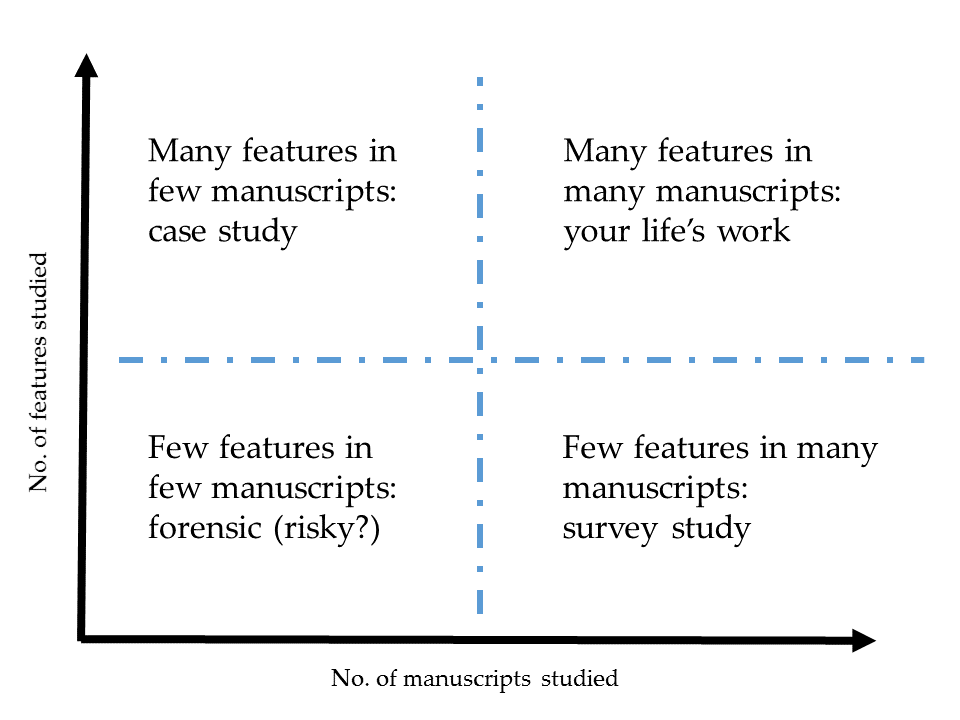
When I was an MSt student preparing to tackle my summative essay on the palaeography and codicology course, Dan Wakelin told the class that it would be best, as a rule of thumb, to study either a few features in many manuscripts, or many features in a few manuscripts. I passed this useful advice on when I taught part of the same MSt course this year. When I came to write my paper for EBS, I realised that this advice was relevant to some of the ways we think about manuscript studies in general, not just when we’re starting out, so I built this diagram.
It seems to me that most pieces of work start out in the bottom left quadrant, and that this is usually an uncomfortable but necessary stage. In Anglophone scholarship we normally then progress upwards to the top left quadrant, working on many features in a few manuscripts to produce precise, detailed case studies. Of course, sometimes the bottom left quadrant is the right place to stay: a single graph or a single previously unnoticed faded note of ownership might unlock an entire research project, and in such cases we find ourselves combing through one manuscript for just one thing! But being in the bottom left quadrant for too long can be risky, if what you need doesn’t turn up.
Some things which interest me, and which are in play in the monograph I’m writing, are: how we might move into the bottom right quadrant, why we might want to make that move, and what the risks of making that move are. I think large-scale part-quantitative surveys inspired by continental scholarship have a lot of potential to increase our knowledge. I also think such surveys can guide us in our selection of case studies. In fact, I’d like to see a symbiotic relationship between the upper left and bottom right quadrants. At the same time, though, we must remember that numbers are not in some simplistic way ‘more true’ than qualitative results, and that the manuscripts we have are probably only a small proportion of those once produced—a patchy and skewed sample. I suspect ‘big data’ might be an inappropriate phrase in quantitative codicology.
Returning from these wider considerations, and returning to the idea that this diagram is also a teaching tool, I think this is quite a useful way to help students begin categorising their approaches and working out an appropriate plan for manuscript projects.
In truth, the contrasts this diagram captures are probably just one specific manifestation of a broader set of rules for handling evidence. I can imagine a historian, for instance, drawing a distinction between studies which consider many details in a few sources and studies which consider a few details in many sources. So perhaps this diagram might be a useful tool more broadly—or perhaps someone somewhere has already come up with it, and I’ve been engaged in reinventing the wheel. I don’t know. But I hope this might be useful for someone out there!
Comments